
We renew ourselves through a brighter, more modern design. Step by step you will be able to see the changes in Kundo.
Maybe you have noticed small design changes in Kundo lately? Step by step, we make the design more consistent and uniform to enhance the experience of working in Kundo.
Among other things, we have developed a new color palette. A well-thought-out color palette enhances the user experience and clarifies various interactions and hierarchy. By working with color shades, we can create better contrast between different parts of the interface and create a harmony that makes it comfortable to work in Kundo's tools. As a first major step, we have now introduced that color palette in the navigation on the left in Kundos Dashboard.
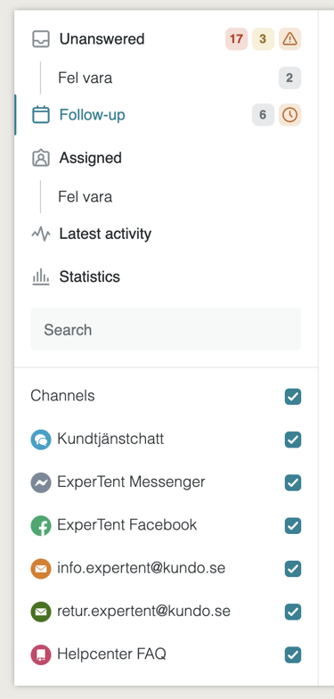
The same color palette will be used in more places in Kundo in the future.
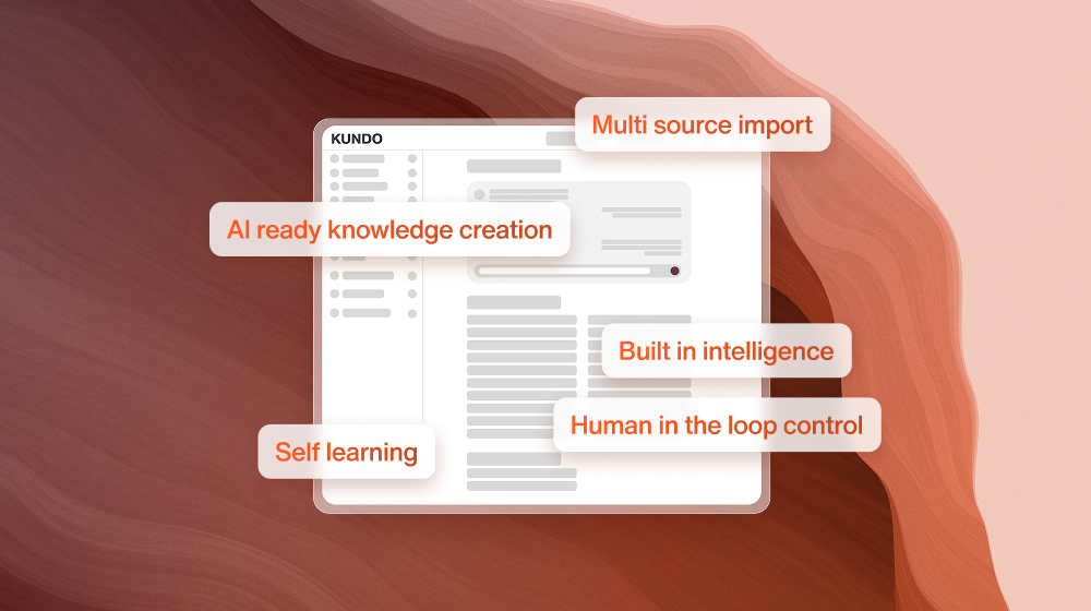
Icons are an important part of the product experience and help you quickly understand a function or meaning. To ensure a high quality, we at Kundo have developed a new set of icons. The new icons have thick lines and soft, rounded corners to create a more pleasant user experience.
Also, all buttons in Kundo have been updated and are now more consistent.
Kundo's design will continue to be updated, so stay tuned for more changes!
We hope you enjoy Kundo's new clothes!
We renew ourselves through a brighter, more modern design. Step by step you will be able to see the changes in Kundo.